Written by Jennifer L. Holm
Illustrated by Matthew Holm
(Random House, 2009)
I’m not a fast reader. In fact, I strongly discourage people from trying to race through a book in much the same way they’d attack a math drill. Reading is as much about thinking and responding to text and pictures as it is tackling a passage with fluency. And yet I will admit with this book, there is something immensely satisfying in finishing a ninety-page book in the time it takes to read a picture book.
Babymouse Dragonslayer is one of a graphic novel series developed by the brother-sister team of Jennifer and Matthew Holm. I first learned of the series when I took some students on a shopping expedition at a children’s bookstore. A grade two boy was on a Babymouse quest. He could not listen through the staff member’s orientation or the introduction of specially set aside hot, new books. “Where is Babymouse? Do you have Dragonslayer? What about Babymouse Burns Rubber?” It was Babymouse or bust.
For a young reader, working through this book instead of a basic reader instills a sense of pride and builds on one’s identity as a reader. It also provides a bridge from picture books to novels: more words, more pages, but also a picture for virtually every sentence or speech bubble. Hurrah for graphic novels!
Poor Babymouse feels doomed by math problems. She is hopeless. Her latest failing math test proves it. (Never mind that she spends math class daydreaming about saving a kingdom from a ruthless dragon.) To her horror, her teacher insists that Babymouse spend her lunch hours on the school’s Mathlete Team, the Fighting Fractions. The team is preparing to compete against the Hypotemooses and the mighty, all-knowing and downright mean Owlgorithms. The stakes are high. Long ago, the Owlgorithms “snatched the Golden Slide Rule and carried it back to their lair, turning it to their own nefarious purposes.” How, oh how, can the Fighting Fractions expect to emerge victoriously with the befuddled Babymouse in their midst?
While Babymouse dreads math, she loves reading. She transports through her locker into the world of The Lion, the Witch and the Wardrobe. She stumbles upon Middle-earth. Imagine the Cool Factor a few years down the line when the reader discovers that Babymouse gave a nod to the classics. (“Hey! C.S. Lewis copied this from Babymouse!”) It is yet another way Babymouse Dragonslayer helps readers approach new hurdles.
Some boys may be turned off the series based on its design. The cover and the pages within contain black and white drawings washed in—gasp—pink. While Laverne of sitcom fame always wore a cursive L, Babymouse sports a pink heart on all her clothing. If these superficial components create initial resistance (and, my gosh, let’s hope they don’t), all it takes is a buddy or an eager adult to join in with the reading of the first ten pages. I suggest taking parts. Let one person say all Babymouse’s lines while the other creates a distinct voice for the narrative boxes. Partners could then divvy up the other parts as they arise.
The illustrations are great fun. I particularly enjoyed a wordless page of four cells that showed how the Mathlete competition whittled down to the final contestants. Yes, you have to read the pictures. There is also subtle and more obvious humor throughout. My favorite exchange: One character, feeling doomed about the pending showdown says, “This is our darkest hour.” Babymouse responds, “Well, it IS almost dinnertime.”
I can see readers going back for seconds and thirds of this book, zipping through it with increasing speed and comfort while awaiting the next installment. Babymouse, the reading superhero!
Friday, July 29, 2011
Wednesday, July 27, 2011
SOME SMUG SLUG
Written by Pamela Duncan Edwards
Illustrated by Henry Cole
(HarperCollins, 1996)
Confession: I am a slug sympathizer.
When I go hiking with others, the adults and kids always respond the same to slug sightings: "EWW!" I don't get it. I think the lowly slug is misunderstood. Give him a PR makeover.
Some Smug Slug only does further damage to the critter's reputation. Pamela Duncan Edwards portrays the slug as an obstinate dope who refuses to listen to the other creatures of the forest. Whereas in most tales a flawed central character changes for the better, the smug slug stays the same. He slithers up an unknown rise in the topography despite the alarmist cries from a spider, a swallowtail and a skink. The slug pays dearly in the end.
Edwards' text is an alliterative ode to the letter 'S'. "Slowly the slug started up the steep surface, stringing behind it scribble sparkling like silk." This constriction on word choice means that much of the vocabulary will be unknown to young readers (e.g., shambled, sinister, shantung). A key word in the final sentence may even require explanation to comprehend the story's ending. This is a story that should definitely begin as a read-aloud. However, with much practice, I can see some youngsters enjoying speeding through the story. Not as fun as tongue twisters or Green Eggs and Ham, but still something to smile through.
The illustrations, created by Henry Cole using acrylic paint and colored pencils, are exquisite. In fact, they serve as a springboard to a forest walk. Who wouldn't want to explore nature further after taking in his detailed, closeup scenes? And maybe that's where I take solace. While the story doesn't do slugs any favors, I think young viewers will still see a likable being based on Cole's art. A chance to stop and study them in person can only help their cause. Perhaps the book will inspire a future botanist.
Monday, July 25, 2011
BIRD
Written by Zetta Elliott
Illustrated by Shadra Strickland
(Lee & Low Books, 2008)
There are goofy picture books about green eggs and curious monkeys. Splendid reads. But what amazes me about the genre is the variety and how much depth can arise in so few pages. Bird is a book that has both inspired and haunted me. It examines drug addiction through the eyes of a child, humanizing it with both anger and compassion.
The title refers to the main character, an African-American boy, nicknamed by his deceased grandfather who likened him to a chirping bird demanding to be fed as a baby. The title refers to much more: the boy's fascination with drawing birds, Charlie Parker (also nicknamed Bird), the planes his grandfather flew during war, the rooftop escape from street life and ultimately heaven.
With brother Marcus and his grandfather gone, the grandfather's best friend Sonny (Uncle Son) who mentors the boy. It is a relationship of mutual respect, with the boy keeping Uncle Son on his toes and the elder offering wisdom such as, "You just remember, everybody got their somethin'. And that includes you."
The boy's "somethin'" is his growing talent sketching. In art, he says, "you can fix stuff that's messed up just by using your imagination or rubbing your eraser over the page."
In life, however, it's not so easy.
As the boy recalls his brother, an artist who expressed himself through graffiti, he recognizes the encouragement and advice Marcus gave for the boy's own budding drawing talent. Initially, the boy does not realize Marcus' change is from drugs:
He never let me go up on the roof with him. But sometimes afterward, he'd take me to the store and buy a big bag of chips and two bottles of soda. Then we'd go to the park and hang out. I never asked him why his eyes were so red. I just listened to my big brother talk about the sky.
Things worsen. In time, the boy is not permitted to let Marcus in the family apartment. Marcus still manages to tell his younger sibling, "It's not too late for you."
The story is heartbreaking, yet hopeful. Uncle Son tells the boy about a time when slaves learned to fly, soaring in the skies after dying in chains. The boy asks, "Is Marcus in heaven or in Africa?" The elder tells the boy Marcus is at peace.
Strickland's illustrations, softly realized in watercolor, gouache, charcoal and pen, are magnificent. She limits her palette to blues, brown, black and cream, giving an airy feel. Elliott's words dazzle from the outset as the boy glimpses a bird outside, "perched on the rusty rail of the fire escape shivering in the winter wind." Her text is a perfect example of the beauty coming from a wordier picture book, one that bucks the trend of adhering to absurdly low word limits. But then, Elliott's book is exceptional in its target audience as well. Yes, younger children can learn about the dangers of drug usage, but this book may resonate more with tweens, teens and adults.
It's a book that lingers. Bird is a treasure.
Friday, July 22, 2011
TRANSFORMED: HOW EVERYDAY THINGS ARE MADE
By Bill Slavin
(Kids Can Press, 2005)
Well, this week has evolved into a week of nonfiction titles that might appeal to boy readers. More specifically, This is Daniel Cook at the Construction Site, Building and Transformed all focus on building things. Slavin's extraordinary book, however, examines how smaller, ordinary objects are made.
This is not a picture book; rather, it is an example of current nonfiction that many readers will find more appealing than more traditional fare. Transformed looks at the process of taking raw materials and, yes, transforming them into familiar objects. From what I've observed, kids are hooked immediately upon glancing at the sixty-nine items listed on the Contents page. The reader can skip around, picking the items that interest him. (One thing that often appeals to kids is being told that they don't have to read every page or every section of nonfiction works. That's a freeing revelation for a young reader who isn't accustomed to checking out 160-page books! Moreover, reading nonfiction more closely resembles the way people read on the Internet where they scroll down and click some items while overlooking others.)
From the Contents page, kids can choose to read how baseballs, chewing gum, teddy bears, dental floss, pencils, fortune cookies, licorice, running shoes and bricks are made. (So many compelling choices! I had a hard time offering only a few examples, thinking that I cannot adequately represent the scope of the book.) I use this book as a read-aloud to grade two and three classes. Yes, there should be MORE nonfiction read-alouds by teachers. I only read one section per day after letting students examine the table of contents, nominate possible topics and vote. Student choice makes more engaged listeners.
Each topic receives a double-page spread. Watercolor and ink illustrations accompany the written steps which range from four steps (toothpaste; blue jeans) to eleven steps (guitar; iron and steel). The pictures are playful, with miniature people in blue overalls busily demonstrating the processes. As well, each topic includes an introduction that provides a historical background about the origins of the product. For example, in ancient times Greeks and Romans played with marbles made of clay before Germans made them from marble in the 1600s and Italians later created them from glass. There is also a sidebar containing trivia (e.g., For soap, "[t]he leftover glycerin (step 2) isn't wasted. It's used for making two common products: hand lotion and dynamite.").
The wording in the steps is often quite technical. That is why I like to introduce the book in a read-aloud format. After talking together about 8-10 of the topics, the book is then available for anyone during leisure reading time. It becomes a coveted reading item and, in my experience, has been listed as the favorite book of the year by several readers, particularly boys.
Wednesday, July 20, 2011
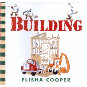
BUILDING
By Elisha Cooper
(Greenwillow Books, 1999)
There are many picture books that are breezy reads with cute illustrations, but they fade from memory shortly after closing them. A good book is one that lingers. Elisha Cooper's Building had me flipping back to reread fresh phrasing and peeking again at his simple, yet effective pencil sketches filled in with watercolors.
After reading the disappointing This is Daniel Cook at the Construction Site, I searched for a better book to captiure boys' fascination with construction. I'm a ferry ride away from a well-stocked bookstore so I had to settle for what I could find at my small, but vibrant local library. Building was a surprise discovery.
I'd anticipated coming across a loud book with big bold text matching photos of monster-sized bulldozers and cranes in action. Building is not that book. Instead, it is a quiet, reverant homage to the tasks and the workers in the construction industry, more real than any photojournalist's work.
The reader gets a full sense of the sounds, sights and feel of transforming a barren lot into a new building "waiting to be filled with people." The backhoe, cement truck and crane all get their due, but the construction workers earn the spotlight. Cooper's writing comes alive in the rich details. "Another worker smoothes the wet concrete. His hands are crusted in gunk and he has to use his wrist to push his glasses up to his nose." He compares a wheelbarrow of mortar to "a big tub of oatmeal." His portrayal of life on the work site includes the radio tunes that keep painters company ("Some days they hear the same song five times."), the choices during lunch and even mentions bathroom breaks ("[One worker] finds the Porta Potti."). Women work alongside men on site. ("[A]nother worker opens sawhorses, puts in her ear plugs and cuts boards for the first floor.")
Published a dozen years ago, I wonder if an editor would save a manuscript like this from a slush pile today. The language is not watered down for 4-6 year olds. While every word matters, the word count is high in the current 600-words-or-less picture book world. More allowance for nonfiction? Maybe, but Cooper's sentences contain clauses and are often metaphorical. ("With the skeleton of the building in place, the skin goes on.")
Perhaps to minimize language concerns, the text is creatively shaped and chunked. When an architect and workers survey the empty lot, the text crawls around the perimeter of the double-page spread. The text regarding the cement truck spills from the chute of a cement truck sketch and forms the rounded image of the drum.
As a read-aloud, this book will have more meaning through repeated reads over several years. I can also see it being used to teach descriptive writing in grades three and four, something to go along with literary examples of flower gardens and pristine lakes. Description is not just in the adjectives which are used sparingly in Building. The actions must be realistic and vivid. Kids will smile as they easily visualize passages like, "A contractor lugs toilets up stairs. She bumps into walls and can't see her feet." (Again, more toilet talk without the base humor.)
Elisha Cooper's Building makes a substantial addition to any picture book collection.
Monday, July 18, 2011
BOOKS ABOUT CONSTRUCTION
ARE YOU MY MOTHER?
By P.D. Eastman
(Beginner Books, 1960)
THIS IS DANIEL COOK AT THE CONSTRUCTION SITE
Written by Yvette Ghione
Illustrated and designed by Celeste Gagnon
(Kids Can Press, 2007)
It is often said that up until grade four children are "learning to read" while they are "reading to learn" from grade four onward. The statements are simplistic. I would think my first forays on the Internet as an adult constituted a new chapter in my own learning to read (How do I go back?! If there are 3,140,000 articles on "mosquito repellent"--you can tell where my mind's at today--, what should I click?). And, most definitely, young children are learning a great deal as they read or listen to early picture books. Still, the publishing industry (and many teachers) have stuck with the learning/reading dichotomy. Perhaps that's partly why it is more cumbersome to find a decent nonfiction picture book than a catchy, funny work of fiction.
The first true "learning to read" book I recall from my childhood was P.D. Eastman's Are You My Mother? I have fond memories of the dopey little bird who falls out of its nest. Whenever I come across a worn copy in a library (with ample amounts of librarian's tape slathered here, there and everywhere), I stop and give it another read. The words are simple and repeated often to help the budding reader increase sight words and correctly guess words from sentence and story context. The illustrations are grey-brown with red and yellow accents. (The drawings of the kitten and the hen would never be considered gallery-worthy as many of today's figures in picture books. Dog and cow show more expression though proportions are not quite right.)
None of that matters. It's the goofy, inquisitive bird that commands full attention. For me, the highlight of the story always comes down to little bird's "conversation" with the massive red machine, seemingly powered by no one. "Mother, Mother! Here I am, Mother!" gets the distinct reply, "Snort." I giggle at the silly bird and I love how the machine comes to the rescue. Forget humans and animals; machines can save the day! Vroom, vroom!
I was intrigued by the title This is Daniel Cook at the Construction Site (when I did an unsuccessful library search for a current bestseller, Goodnight, Goodnight, Construction Site). The publisher, Kids Can Press, focuses on nonfiction so I grabbed the title to see how current nonfiction is designed to engage young (boy) readers, the kind of readers who find awe in the power of big machines.
I typically only select books that I like for blogging. Let another online someone relish in not having something nice to say. This book would have been a pass, but I feature it for two reasons. First, I was troubled before opening the book. The only words on the cover and spine are the title. Wordless book? I peeked in; plenty of text. I cringe when an author fails to get due credit. The writer's name did not appear on the title page either. Writer Yvette Ghione and illustrator/designer Celeste Gagnon are only recognized in the fine print on the last page of the book. Oh, the injustice!
My second quibble is that the book takes a subject of high appeal to many youngsters and does the old-fashioned nonfiction treatment, making the book a far distant cousin to Tonka gear and real construction sites. There are lots of curvy red arrows linking still photos to text but that's about all the bounce to be found in this book, part of a series based on the Canadian television show "This is Daniel Cook". The focus of the construction site, the making a new sidewalk, lacks the draw of a building demolition and a new skyscraper project or even the creation of a new house. And I shook my head when the writer twice compared framing the sidewalk and pouring cement to baking a cake. The comparisons were unnecessary and highlighted a lack of understanding for the audience.
Not being awed by construction (now or ever), I did learn something from Daniel Cook. That Snort from Are You My Mother? I'd always referred to it as a bulldozer or a crane. Turns out I'm as silly as the bird. It's a backhoe. Go figure.
Still, when given the choice between the classic fiction and the authentically photographed recent nonfiction, it still isn't a contest. Little bird and Snort win.
Friday, July 15, 2011
ON MY ISLAND
By Marie-Louise Gay
(Groundwood Books, 2000)
After reviewing Not a Box by Antoinette Portis in my last post, I thought of On My Island by Canadian author/illustrator Marie-Louise Gay. It's clear that the bunny in Box has an active imagination. What if a child, however, lacks imagination? He even lacks observation skills to take in the amazing world around him. (Think about the upcoming so-called dog days of August when kids hang upside down on sofa, sigh loudly and complain that there's nothing to do.)
According to the boy from On My Island, nothing happens where he lives. Ho-hum. Yawn. The boy just hangs with his (ordinary?) crew: "a wolf, two cats, three ants and a...swo-o-o-ooping bat."
Confession: I was hooked by the three ants. The rest of the critters didn't matter. The wonderful thing about picture books is you can insert something as seemingly random as three ants and keep the viewer's interest throughout. Turning each page, I immediately looked for the typically miscast picnic pests. (Another great thing about picture books? If you get so focused on ant spotting that you miss the story, you can read it again!)
Gay is a masterful storyteller and illustrator. On My Island allows her own imagination and illustrative talents to shine. While the boy and his entourage look one direction, they miss the fanciful, often surreal events around them. (Think Salvador Dali or children's author/illustrator David Wiesner.) Elephants fly in parachutes (and as a kite), a train emerges from the ocean, a large teacup floats by, a dragon pursues a fish which flees on roller skates. There is plenty of visual impact on each page--look beyond the ants! Alas, the boy and his friends are too wrapped up in themselves and their pervasive state of self-fulfilling ennui to ever notice.
On My Island is a natural for repeated readings/viewings.
Wednesday, July 13, 2011
NOT A BOX
By Antoinette Portis
(HarperCollins Children's Books, 2007)
I love toys. When children walk into my principal's office, they notice two things: (1) kids' books, and (2) toys. In the toy department, I stock the classics: Slinky, Magic 8-Ball, wind-up critters. But I've overlooked an even more popular classic, one that doesn't require navigating your way through PlayStation gadgetry and Transformer movie tie-ins at the local Toys "R" Us. Get your hands on a large cardboard box--large enough to climb in--and watch the fun begin.
This picture book is an ode to the lowly cardboard box, cleverly designed with that familiar drab brown for the cover. (Hey, Benjamin Moore, there's a new paint color for you: ooh, Box Brown.) The title appears in simple red letters along with a "NET WT." stat on the front and a "THIS SIDE UP" on the sparse back cover.
The simplicity continues inside the book, with respect to both text and drawings. The unimaginative narrator's questions (e.g., "Why are you sitting in a box?") are typed on the left page while a simple black-outlined bunny figure literally assumes the position on the otherwise blank right side. Turn the page and bright yellow and red wash over the spread as bunny's imaginative play is revealed.
Life really can be that simple. This book will make you smile and hopefully reignite some of that wonder in the adult mind.
Anybody around here just purchase a new refrigerator? How about I take that box off your hands...
Monday, July 11, 2011
CLOUDETTE
By Tom Lichtenheld
(Henry Holt and Company, 2011)
That's right, Cloudette, not Claudette. I grabbed this book for its originality in creating a new character. If talking hamsters make you cringe, Cloudette, the "cute little cumulus" could precipitate a thunderous objection. Still, I was captivated by Cloudette and her sunny disposition.
Cloudette is tiny. Sometimes that has its advantages, but Cloudette longs to do something big and important. The other bigger clouds create storm fronts, thunderstorms and enough snow to shut down school for a day. (Important, indeed!)
Cloudette faces rejection on her quest to make a difference. The car wash is automated and the plants at the nursery need LOTS of water. Cloudette doesn't matter.
It takes a fierce storm with strong winds to blow Cloudette to a new environment where she finally finds the perfect opportunity.
This is a clever twist on the "different is special" story formula. I read it to a grade one class to see if the students could take to a cloud as a main character and they empathized and cheered for Cloudette in a snap. There is an undercurrent of science appeal in the book as well as kids see the value of rain and become casually introduced to terms like cold front, cumulus and precipitation. Still, the story is what stands out.
The illustrations are often splashed with sky blue backgrounds (naturally). Lichtenheld also has a fondness for yellow, helping to brighten each page. The art figures don't pop, but that helps the viewer focus more on the expressive facial reactions given to Cloudette.
Cloudette would make a good rainy day read.
Friday, July 8, 2011
A PET FOR PETUNIA
By Paul Schmid
(Harper, 2011)
A few years ago, kids were obsessed with penguins. Not practical as pets, but no doubt common items on Christmas wish lists.
Petunia has a different black and white critter in mind: a skunk. Schmid writes, "Petunia wants, wants, wants! a REAL pet skunk." And Petunia is a persistent child.
Parents and children will be able to relate to the pet-begging pitches and promises. If Petunia gets a skunk, it will surely be one pampered pet. But Petunia's parents hold strong, daring to assert that skunks stink.
Petunia's ensuing verbal tantrum is the highlight of the book. (Too many of us will see ourselves in petulant Petunia.) She decides to run away and you can guess what she encounters in the woods.
The simple, amusing black and white illustrations are adorned with splashes of purple and the odd dash of mustard yellow. They are just enough to move the story along. It's Schmid's word choice and phrasing that truly stand out.
While I rarely review books with female protagonists, boy readers will easily connect to Petunia and their own imaginations are likely to be sparked by thoughts of an ultra-stinky pet. Penguins? Yawn. Pigs? Phooey! The skunk's the thing.
Wednesday, July 6, 2011
I'D REALLY LIKE TO EAT A CHILD
Written by Sylviane Donnio
Illustrated by Dorothee de Monfreid
(Random House, 2007)
Sometimes a book's title is too perfect. When I discovered this book on a shelf in a toy store in Seattle, I knew it would make a most amusing addition to the collection I keep in the principal's office. (Runner up that day: Monsters Eat Whiny Children. Oh, how I'd love to meet the store's buyer!)
One clever young office visitor spotted the book and fought unsuccessfully to repress his grin. It was a command reading.
Achilles the crocodile is seemingly content to feast on bananas and the occasional chocolate cake until one day he stages a hunger strike. He wants to eat a child; nothing else will do. Mama and Papa Crocodile are distraught as their weakening offspring cannot be swayed. As they console one another, Achilles sneaks off to the river for a swim. Lo and behold, he spots a child! Dinner! Suffice it to say the hunt doesn't go as planned.
This amusing book provides an inventive way of supporting picky eaters. More than that, it's just plain fun. How can it not become a repeated read?
Subscribe to:
Posts (Atom)